
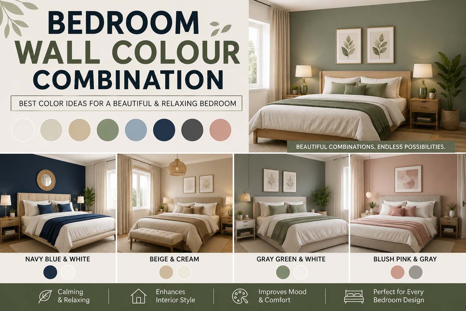
Choosing the right bedroom wall color combination can completely change how a room feels, from calm and restful to bold and exciting. Since the bedroom is the place where you relax at the end of the day and start your morning, the colors on the walls have a larger role than most people realize—affecting mood, how big the room seems, and even sleep quality. With many choices available, finding the right combination can feel difficult, but understanding a few basic ideas makes the process much easier.
In this guide, we’ll walk through popular and effective bedroom wall color combination ideas, how to choose shades based on room size and lighting, and practical tips for pairing colors so your bedroom feels unified, comfortable, and personal to you.
Why the Right Color Combination Matters
Color has a documented effect on mood and energy levels, which is why interior designers pay close attention to color choices in bedrooms specifically. Unlike living rooms or kitchens, which are meant to encourage activity and conversation, a bedroom’s main purpose is rest. A poorly chosen bedroom wall color combination can leave a room feeling small, cold, or overstimulating, while a carefully selected one can make even a small room feel calm, spacious, and welcoming.
Beyond mood, color choice also affects how natural and artificial light interact with the room throughout the day. Lighter colors tend to reflect light and can make a small bedroom feel bigger, while darker, richer colors absorb light and can create a cozy, intimate atmosphere in larger rooms that might otherwise feel empty or impersonal.
There’s also an everyday functional aspect to consider. The walls in a bedroom serve as the background for everything else in the space—from bedding and curtains to artwork and furniture finishes. Choosing shades that go together means you’ll have more freedom when decorating, as a well-thought-out color palette acts as a neutral base that works with a wide range of textiles and accent pieces rather than fighting against them.
Popular Bedroom Wall Color Combination Ideas
Soft Neutrals with a Bold Accent Wall
One of the most lasting ways to create a bedroom wall color combination is pairing soft neutral colors (like warm white, beige, or light gray) on three walls with a single bold accent wall in a deeper shade (like navy, forest green, or terracotta). This choice adds interest without overwhelming the senses and works exceptionally well behind the headboard, drawing the eye toward the bed as the room’s main focal point.
This method is especially popular with renters and first-time homeowners because it offers a low-commitment way to try out colors. If you later decide the accent color isn’t quite right, repainting one wall is much less time-consuming and expensive than redoing the whole room. It also lets you change the room’s atmosphere over time by changing the accent color without disturbing the calming neutral base surrounding it.
Monochromatic Tonal Layering
A monochromatic style uses shades of the same color family throughout the room. For example, pairing a pale blue-gray wall with slightly darker blue-gray bedding, curtains, and accessories creates a unified look that feels planned and calming without requiring you to match multiple contrasting colors.
Warm and Cool Contrast
Pairing a warm color (like blush or soft terracotta) with a cool color (like sage green or dusty blue) creates a balanced, layered look. This kind of bedroom wall color combination works well in rooms with plenty of natural light, as the contrast between warm and cool colors feels dynamic rather than clashing when the lighting is bright and even.
Classic Two-Tone Combinations
Two-tone walls—where the bottom half of the wall is one color and the top half is lighter, often separated by a chair rail or simple painted line—remain a timeless choice. This classic style adds interest to a plain room and can make ceilings feel higher when the lighter color is used above the line.
Earthy, Nature-Inspired Palettes
Color combinations built around natural tones (like olive green, warm taupe, clay, and soft browns) have grown in popularity for their grounding, calming effect. These combinations work well in bedrooms designed to feel like a break from a high-energy lifestyle, reflecting the natural, unprocessed feel of materials like wood, linen, and stone.
Modern & Style-Specific Bedroom Color Ideas
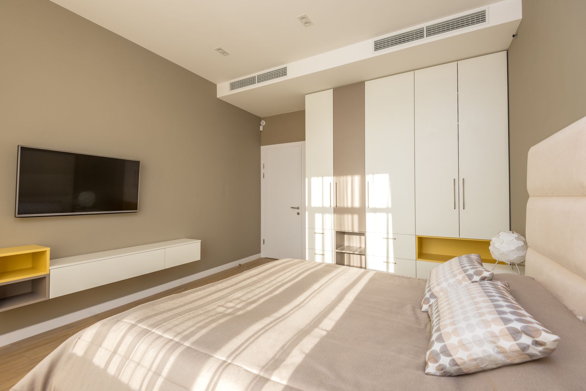
Modern Bedroom Wall Color Combinations
Bedrooms often focus on simplicity. Popular combinations include:
- Charcoal Gray + White: Perfect for contemporary homes and luxury apartments. Accent with black lighting, glass furniture, and metallic décor.
- Taupe + Soft White: Creates a welcoming feel ideal for master bedrooms and minimalist interiors.
- Olive Green + Warm Beige: A growing trend that provides natural warmth, an organic look, and a relaxing atmosphere.
Two-Color Bedroom Wall Ideas
Painting two walls different colors adds interest without overwhelming the room. Accent walls work best when placed directly behind the headboard. Great pairings include:
- White + Navy
- Beige + Olive
- Gray + Blue
- Cream + Brown
- Blush + Gray
Luxury Bedroom Wall Color Combinations
If you’re going for a high-end look, consider these rich pairings:
- Emerald + Gold: Elegant and dramatic. Best paired with velvet headboards, gold fixtures, and dark wood furniture.
- Deep Blue + Beige: Feels both rich and calming. Complete the look with brass lamps, crisp bedding, and marble décor.
- Soft Gray + Silver: Perfect for glamorous interiors when combined with crystal lighting, mirrored furniture, and plush rugs.
Small Bedroom Wall Color Combinations
Small bedrooms benefit from colors that give the illusion of space. Recommended shades include white, ivory, soft blue, cream, and light sage. As a general rule, avoid using multiple dark colors in compact spaces.
Warm Bedroom Color Combinations
Warm colors create an inviting, comforting environment:
- Cream & Terracotta: Perfect for Mediterranean-style homes.
- Beige & Brown: A classic combination that never feels old-fashioned.
- Warm Yellow & White: Bright, cheerful, and welcoming—ideal for guest bedrooms.
Cool Bedroom Wall Color Combinations
Cool colors help transform your bedroom into a soothing retreat:
- Blue + Gray
- Mint Green + White
- Lavender + Cream
- Sage + Gray
- Aqua + White
Earth-Tone Combinations
Nature-inspired colors pair exceptionally well with natural wood furniture:
- Olive Green + Beige
- Clay + White
- Sand + Brown
- Moss Green + Cream
- Stone Gray + Taupe
Classic Neutral Combinations
Neutral colors never go out of style and allow you to change decor easily without repainting:
- White + Beige
- Gray + White
- Greige + Cream
- Taupe + Ivory
- Sand + White
Trending Bedroom Wall Colors for 2026
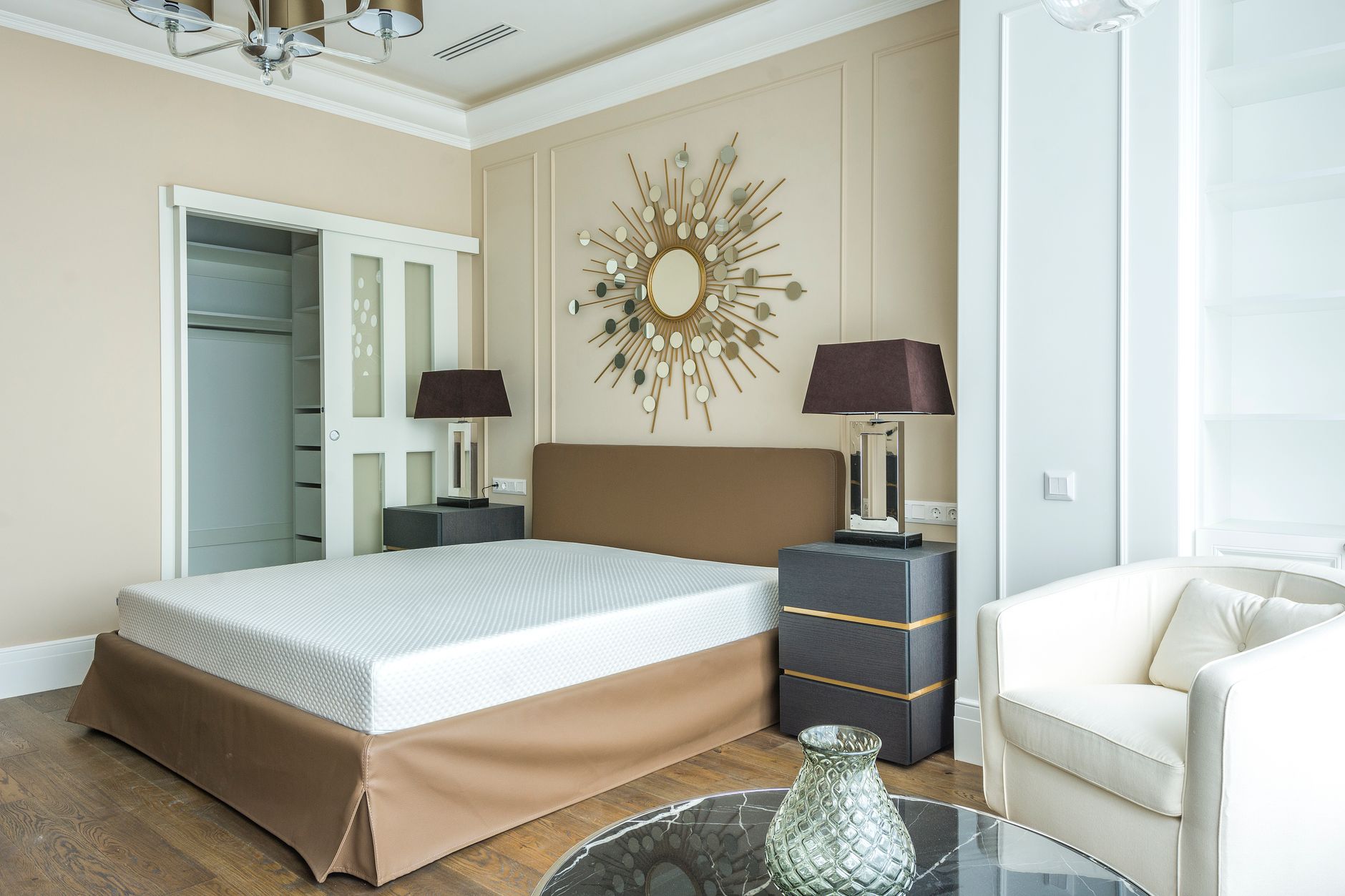
Interior design trends continue moving toward calming, natural color palettes. Key shades for this year include:
- Sage Green
- Warm White
- Mushroom Gray
- Clay Beige
- Dusty Blue
- Soft Olive
- Warm Taupe
- Misty Gray
Matching Wall Colors with Furniture Finishes
Choosing wall colors that complement your furniture creates a unified overall design:
- White Furniture: Looks best with navy, sage, beige, or gray walls.
- Dark Wood Furniture: Pairs beautifully with soft cream, soft white, light gray, or olive green walls.
- Black Furniture: Works best with crisp white, beige, greige, or soft taupe walls.
- Oak Furniture: Complements sage green, warm white, beige, or dusty blue walls.
How to Choose the Right Combination for Your Room
Consider Room Size
Smaller bedrooms usually benefit from softer color combinations that reflect natural light and make the space seem larger. If you want to incorporate a bolder color in a small room, try using it on a single wall so the space doesn’t feel closed in.
Larger bedrooms have the capacity to handle deeper, richer colors on multiple walls without feeling overcrowded. In larger spaces, you can comfortably combine two strong colors—such as charcoal gray paired with warm terracotta—since there is enough physical space for the eye to rest between colored areas.
Think About the Desired Mood
Before deciding on a color scheme, consider what atmosphere you want to create:
- Calming & Restful: Soft blues and greens promote relaxation and better sleep.
- Romantic & Cozy: Warm neutrals and soft blush tones build warmth and intimacy.
- Sophisticated & Dramatic: Bold combinations using navy, charcoal, or deep green work well for a secluded, retreat-like feel.
Also, consider how you use the room beyond sleeping. If you read in bed, work at a corner desk, or practice morning yoga, your colors should support those activities. A warmer, more energetic tone near a reading nook paired with a cooler, calming tone near the bed creates a functional balance.
Coordinate with Existing Furniture and Decor
Your wall colors don’t exist in isolation. They need to work with your existing furniture, flooring, and textiles:
- Wood & Flooring: Honey-toned hardwoods pair best with warm wall tones, while cool gray-toned flooring complements cooler or neutral palettes.
- Textiles: If your bedding and curtains feature specific colors, build your wall color palette around those existing tones to avoid a disjointed look.
Step-by-Step: Planning Your Color Combination
- Evaluate Lighting: Identify your room’s natural light levels at different times of day, as colors shift dramatically between morning daylight and evening lamp light.
- Select a Main Color: Choose a base shade that will cover the majority of the wall space (typically a neutral or soft tone).
- Select an Accent Color: Choose a complementary shade for a feature wall, trim, or two-tone divide.
- Test Paint Swatches: Apply large swatches directly onto the wall across different areas of the room to observe lighting variations.
- Live with the Swatches: Check the swatches over a few days under both natural daylight and artificial evening lighting before committing.
- Finalize Textiles: Once the paint is applied, select matching soft furnishings (bedding, curtains, rugs) to tie the room together.
Tip: Take photos of your test swatches at different times of the day. Photographs often reveal subtle undertones—like a hint of green in a gray or pink in a beige—that are harder to spot with the naked eye.
Common Mistakes to Avoid
- Relying on Small Paint Chips: Always test larger samples directly on the wall rather than choosing straight from tiny paper chips.
- Ignoring Light Direction: A color that looks warm in the store can easily appear cold and flat under north-facing natural light.
- Overcomplicating the Palette: Using too many competing colors can make a bedroom feel chaotic instead of restful.
- Neglecting Trim & Ceilings: Always ensure your trim and ceiling colors complement your primary wall palette.
- Rushing the Decision: Take time to test swatches over several days under different lighting conditions.
- Choosing the Wrong Finish: High-gloss finishes reflect light and highlight wall imperfections; matte or eggshell finishes are softer and far more forgiving in bedrooms.
- Overlooking Undertones: Neutral shades of white and gray carry warm or cool undertones that only become apparent when applied to a full wall.
Popular Color Pairings by Interior Style
- Modern & Minimalist: Gray paired with crisp white and a single black accent (such as a headboard frame or picture rail).
- Cozy: Warm cream paired with a burgundy or forest green accent wall, finished with brass or gold hardware.
- Relaxed: Soft blue-gray paired with white trim and natural wood tones for a light, airy feel.
- Bohemian & Eclectic: Terracotta paired with mustard or deep teal accents, layered with textured textiles and patterned furnishings.
- Scandinavian-Inspired: Pale dove gray paired with blush or muted sage green, kept simple with minimal contrast for a serene look.
Frequently Asked Questions
What is the best bedroom wall color combination for a small room?
Soft neutrals like white, light gray, or pale beige tend to work best in small bedrooms because they reflect natural light and create the illusion of space. Adding an accent wall in a slightly deeper shade behind the bed can introduce visual depth without making the room feel cramped.
Should all four walls be the same color?
Not necessarily. Many popular combinations use a neutral tone on three walls with a bolder accent color on the fourth—typically behind the bed—to create a focal point. However, an all-in-one color scheme can also work beautifully, especially in rooms with unique architectural details like exposed beams or a fireplace.
What colors are best for a calming bedroom atmosphere?
Soft blues, sage greens, and muted neutrals are ideal for relaxation, as cooler and desaturated tones tend to calm the mind more effectively than bright, saturated colors. Using matte or eggshell finishes further enhances this effect by diffusing light softly.
How do I know if a color will look good in my bedroom’s lighting?
Paint large swatches (at least two feet square) directly on multiple walls. Observe how the shade changes throughout the day, including morning light, direct afternoon sun, and artificial evening lighting.
Can I mix warm and cool tones in the same room?
Yes, as long as they are balanced thoughtfully. Pairing one warm tone with one cool tone—such as blush pink with sage green—creates a rich, dynamic look, provided both shades share a similar level of softness or saturation. Avoid mixing extremely vibrant warm tones with muted cool tones to keep the palette balanced.
Do dark colors make a bedroom feel smaller?
Darker tones make a room feel cozier and more intimate, but they don’t necessarily make it feel uncomfortably small if balanced with good lighting, mirrors, and lighter furnishings. In fact, deep colors are often intentionally used in bedrooms to create a comfortable, protective atmosphere.
Conclusion:
Whether you prefer a simple monochromatic palette, a dramatic accent wall, or a warm-and-cool contrast, the key is choosing colors that feel cohesive with your existing furniture and support a restful environment. Take your time testing swatches under different light levels to ensure your final color combination feels intentional, comfortable, and uniquely yours.
1 thought on “Bedroom Wall Color Combination: Complete Guide to Choosing the Perfect Palette”