
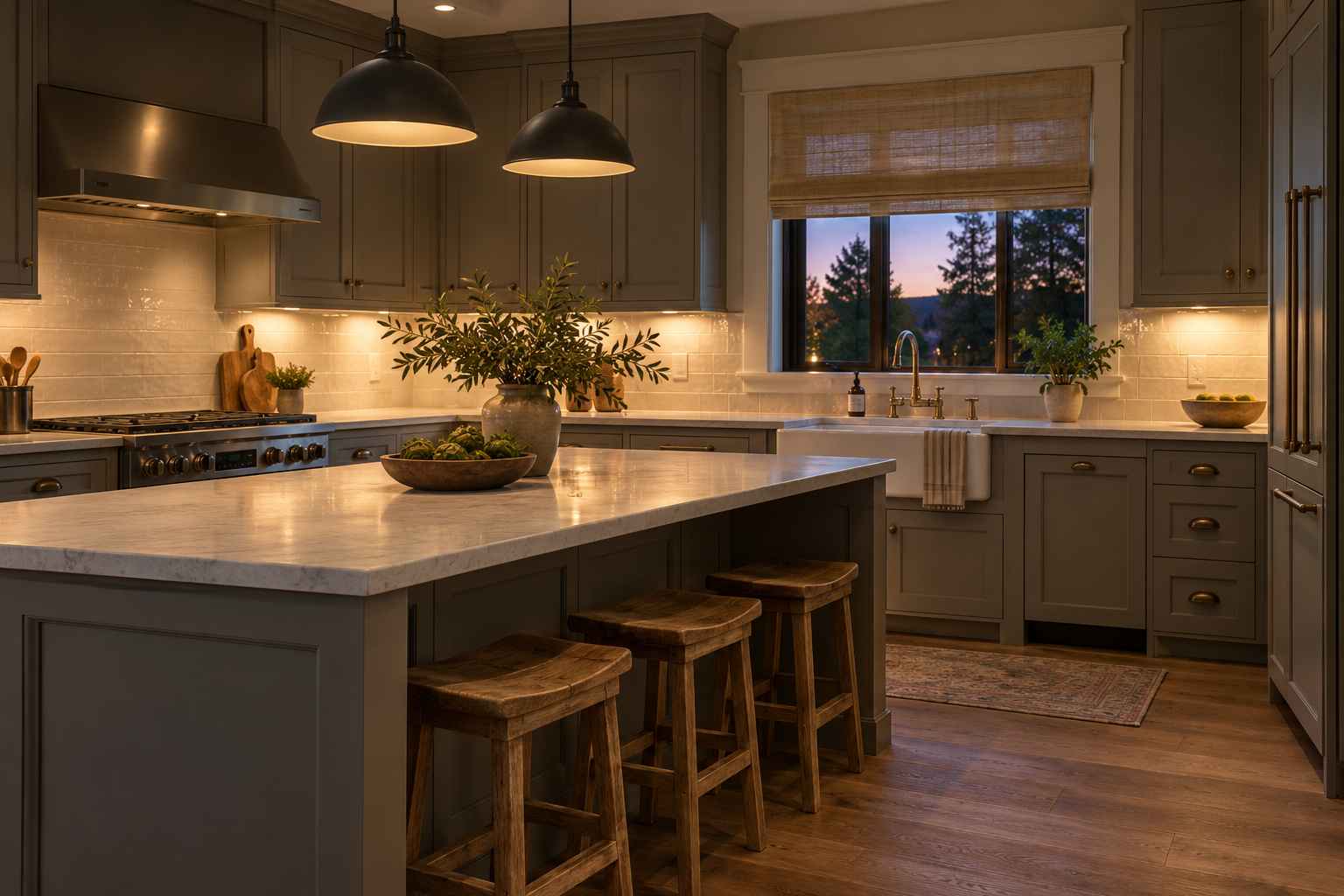
There is a reason gray kitchen cabinets appeal to homeowners with very different tastes. They can feel soft and welcoming in a cottage kitchen, crisp in a modern apartment, or quietly elegant in a traditional home. The difference comes down to the shade, surrounding materials, and light. Choose those elements thoughtfully, and gray becomes a flexible foundation for a kitchen that feels comfortable every day.
However, picking a color from a tiny paint card rarely tells the whole story. A shade that looks neutral in a showroom might appear blue beside your countertop or slightly purple beneath your evening lights.
This guide explains how to choose a suitable gray, coordinate finishes, add warmth, and avoid decorating mistakes. Whether you are updating existing cupboards or planning a complete renovation, the goal is a kitchen that looks cohesive and works for your household.
Why Gray Works in So Many Kitchens
The appeal of gray kitchen cabinets lies in their ability to sit between lighter and darker finishes without dominating every other choice. Pale shades offer gentle contrast against white walls, while deeper tones give an island or lower cabinets more definition.
Gray also works across several cabinet styles. Shaker doors feel familiar and relaxed, flat fronts create cleaner lines, and more detailed profiles suit traditional interiors.
Another advantage is decorating flexibility. You can introduce green plants, terracotta pottery, patterned textiles, or natural timber without changing the cabinetry.
Still, gray is not automatically neutral in every setting. Its undertone can influence the entire room. Think of the cabinet color as one member of a team that includes flooring, counters, walls, lighting, and metal finishes.

Start With Undertones Before Choosing a Shade
Before selecting gray kitchen cabinets, look closely at the surfaces you intend to keep. Existing flooring and countertops usually provide a more useful starting point than an inspiration photograph.
A warm gray may contain beige or brown undertones. A cool gray may lean toward blue, green, or violet. Those differences can become more noticeable beside other materials.
For example, a blue-leaning cabinet sample might feel sharper beside creamy tiles than it does against a clean white wall. Benjamin Moore’s color guidance explains that lighting, surrounding colors, and furnishings can amplify or soften undertones.
Test Samples in the Actual Room
Paint large sample boards using the recommended primer and number of coats. Stand them vertically where the cabinet doors will be.
Check them:
- In morning daylight.
- During the afternoon.
- Under your usual evening lighting.
- Beside the countertop and floor.
- Near both bright windows and darker corners.
Avoid choosing from a phone screen alone. Photographs, editing, and screen settings can all change how a color appears.
Light Gray: An Airy, Gentle Starting Point
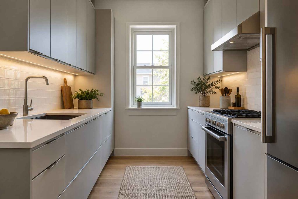
Light gray kitchen cabinets can create a softer alternative to bright white, especially when you want subtle contrast without a dramatic color change.
Dove, pearl, and pale stone shades work well as starting points for an understated scheme. Pair them with a light countertop and a backsplash that shares a compatible undertone.
To keep the room from feeling flat, introduce differences in texture. A painted door, timber stool, glazed tile, and woven blind can share a quiet palette while still looking distinct.
You do not need every surface to be pale. A darker faucet, a few black picture frames, or medium-toned wood can provide definition.
For a relaxed result, use one main cabinet color and repeat a small number of supporting finishes throughout the room.
Dark Gray: Depth Without an All-Black Scheme
Dark gray kitchen cabinets create a stronger visual presence. Charcoal and graphite shades can define an island, anchor a wall of storage, or bring contrast to a mostly white kitchen.
Before committing, consider how much dark cabinetry you will see at once. A deep-colored island beneath open space feels different from tall cupboards covering several walls.
If you love charcoal but worry about heaviness, keep the upper cabinets lighter. Another option is using the deeper shade only on the lower units.
Balance the dark finish with lighter counters, a simple backsplash, and sufficient task lighting. Wood accents can soften the transition between dark doors and pale surfaces.
Check maintenance expectations, too. Very dark finishes may make pale dust, water marks, and certain fingerprints more noticeable.

Choose a Cabinet Style That Suits the Home
Color attracts attention first, but the door profile has just as much influence on the finished kitchen.
Shaker Doors
Shaker cabinetry has a framed appearance that works with many decorating styles. Simple handles and restrained trim keep it versatile.
Choose a narrower frame for a lighter visual effect or a more substantial profile when the room has traditional architectural details.
Flat-Front Doors
Flat fronts create an uninterrupted surface with fewer decorative lines. They suit contemporary spaces and compact kitchens where visual simplicity matters.
Consider how the handles affect the overall appearance. Integrated pulls, discreet knobs, and long bar handles each create a different rhythm.
Detailed or Inset Designs
More decorative doors can look elegant in period-inspired interiors. Give them breathing room by keeping the backsplash and hardware relatively restrained.
A richly detailed cabinet front rarely needs several competing patterns nearby.
Countertops That Create the Right Balance
When pairing countertops with gray kitchen cabinets, begin with undertones and pattern rather than a material name alone. Two white countertops can look surprisingly different beside the same painted door.
White and Off-White Surfaces
A pale countertop can provide clear separation from medium or dark cabinetry. Compare crisp whites with creamier options before deciding.
Bring a cabinet sample when viewing slabs or larger displays. Small samples may not reveal the full movement of a patterned surface.
Wood Countertops
Wood introduces grain and warmth. It can be especially appealing on an island or breakfast area where you want a softer visual break.
Before choosing it, understand the finish, cleaning requirements, and care needed around sinks and frequently wet areas.
Dark Countertops
A dark counter can create a tailored, closely coordinated scheme. However, check that the cabinets and countertop remain visually distinct.
If both surfaces are similarly dark, lighter walls, a brighter backsplash, or timber accents can help define the room.
Backsplash Ideas That Add Interest
A backsplash beside gray kitchen cabinets can either support the cabinetry quietly or become the main decorative feature.
Simple white tile is an easy starting point, but tile shape, surface texture, grout color, and layout all influence the result.
For example, a glossy handmade-look tile creates a different mood from a flat matte rectangle, even when both are ivory.
Consider these combinations:
| Desired look | Backsplash direction | Supporting detail |
|---|---|---|
| Soft and welcoming | Cream or ivory tile | Warm wood accessories |
| Clean and contemporary | Plain white tile or slab | Simple hardware |
| Gentle color | Muted green or blue tile | Restrained countertop pattern |
| Traditional character | Small-format tile | Classic knobs and lighting |
| More texture | Subtly varied glazed tile | Quiet surrounding surfaces |
If the countertop has bold veining, a calmer backsplash usually makes coordination easier. When both surfaces contain strong patterns, compare large samples together before ordering.
Flooring That Keeps the Palette Connected
The floor occupies a large area, so its relationship with the cabinetry deserves careful attention.
Natural-looking oak can introduce warmth and visible grain. A restrained stone-look tile can support a quieter scheme. Patterned flooring can add character when the other surfaces remain simple.
Be cautious about choosing several similar grays without testing them together. A cool floor and a warmer cabinet finish can make each other’s undertones more obvious.
Matching every surface exactly is not necessary. Aim for a clear relationship instead: compatible warmth, deliberate contrast, or repeated colors.
If the floor is staying, treat it as a fixed design element. Selecting paint around an existing floor is usually more practical than trying to disguise a mismatch with accessories later.
Hardware: A Small Detail With a Strong Effect
Handles and knobs change how cabinetry feels in use as well as how it looks.
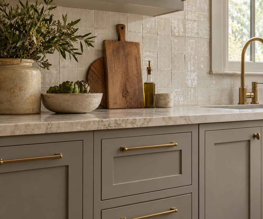
Brass can introduce warmth, brushed nickel offers a softer metallic finish, and black provides a stronger outline. Try a real sample against the cabinet door before buying a complete set.
Think about scale. A tiny knob may look lost on a wide drawer, while an oversized pull can overwhelm a narrow door.
Comfort matters, too. Check whether the handle is easy to grip and whether its projection could catch clothing near a busy walkway.
When replacing existing hardware, measure the distance between screw holes. Matching that measurement can prevent unnecessary filling and drilling.
Image placement: Use the generated close-up of shaker fronts, brass handles, and an ivory backsplash.
Suggested filename: gray-shaker-brass-hardware-detail.png
Alt text:
Make a Small Kitchen Feel More Open
In compact rooms, gray kitchen cabinets work best when the overall design avoids unnecessary visual interruptions.
That does not mean everything must be white or pale. A small kitchen can carry deeper colors, provided the lighting and contrast feel intentional.
Start with practical improvements:
- Keep frequently used work surfaces clear.
- Use consistent hardware throughout.
- Choose a backsplash with a manageable amount of pattern.
- Add lighting beneath wall cabinets.
- Preserve useful storage rather than replacing it all with open shelves.
Tall cabinets can reduce clutter by providing more enclosed storage. However, consider their placement carefully so they do not overwhelm the room’s main sightline.
A few open shelves may soften a wall of cupboards, but they work best when you have a realistic plan for keeping them organized.
Add Warmth Through Materials and Lighting
A gray scheme can feel comfortable when it includes enough texture and variation.
Introduce wood through stools, shelves, cutting boards, or flooring. Add softer elements with a washable runner or a simple fabric blind placed appropriately away from cooking hazards.
Plants and herbs can bring life to the room without requiring a new permanent color scheme.
Lighting also deserves attention. Combine general ceiling illumination with task lighting over work areas. Decorative pendants can add atmosphere, but they should not be the only light source.
Evaluate your cabinet sample under the bulbs you plan to use. Changing the lighting after choosing the paint can alter the effect you liked.
Avoid filling every corner with decorative objects. A few useful, well-chosen pieces often make the room feel more welcoming than crowded counters.
Painting Existing Cabinets: Prepare Before You Decorate
If the layout and cabinet boxes are sound, painting may be worth considering. However, gray kitchen cabinets will only look as good as the surfaces beneath the finish.
Start by identifying the material. Solid wood, previously painted doors, laminate, and wrapped surfaces may require different preparation and coating systems.
Sherwin-Williams emphasizes removing grease and preparing cabinet surfaces properly before priming and painting. Follow the instructions for the specific products and substrate rather than assuming one method suits every kitchen.
A typical project involves:
- Removing and labeling doors, drawers, and hardware.
- Cleaning surfaces thoroughly.
- Repairing suitable minor defects.
- Preparing the existing finish as directed.
- Applying a compatible primer where required.
- Applying the recommended finish coats.
- Allowing the specified drying and curing time.
Painting cannot repair swollen boards, failing joints, or badly damaged door coverings. Address those problems before spending time on a decorative finish.
Plan the Budget Around the Actual Scope
Start with a list of what needs changing and what can stay.
Hardware, lighting, wall paint, and accessories may be enough to improve a kitchen whose cabinetry is already in good condition.
A larger project might include refinishing, replacement doors, new drawer hardware, or additional storage. Full replacement makes more sense to investigate when the layout or cabinet structure is the main problem.
Compare quotes that cover the same work. Ask whether preparation, repairs, materials, installation, disposal, and touch-ups are included.
Also consider disruption. A cheaper option may require more of your own time or leave the kitchen partly unavailable for longer.
Choose the improvements that solve daily frustrations first. Better drawer access or usable task lighting can provide more lasting value than another decorative feature.
Common Mistakes to Avoid
Choosing Every Finish Separately
A beautiful countertop, tile, and paint color can still clash when combined. Assemble a small collection of physical samples before placing major orders.
Making Every Surface Gray
Too many similar tones can blur together. Use differences in lightness, texture, and material to give the room definition.
Ignoring Adjacent Rooms
In an open-plan home, the kitchen is part of a larger view. Repeat a wood tone, metal finish, or accent color from nearby spaces.
Rushing the Final Decision
Live with samples for several days when possible. A cabinet color should work during ordinary evenings as well as in flattering daylight.
Everyday Care for Painted Cabinetry
Use the cleaning method recommended by the cabinet or coating manufacturer.
As a general habit, wipe spills promptly and dry damp areas rather than letting moisture sit around joints and edges.
Pay particular attention to handles, sink cabinets, and doors beside cooking areas, where marks tend to accumulate.
Avoid treating a painted finish like a tiled surface. Abrasive pads and aggressive cleaners may damage it.
Keep the paint name, finish information, and installation details somewhere accessible. Those records make future repairs, matching, or warranty questions easier to handle.
Frequently Asked Questions
Are gray kitchen cabinets still a good choice?
Yes, if the shade suits your home and you enjoy living with it. Focus on compatible undertones, practical storage, and quality finishes rather than choosing solely because a color appears fashionable.
What wall colors work with gray cabinetry?
White, soft cream, muted green, and some pale blue shades can work. The right choice depends on the cabinet undertone and fixed surfaces. Compare wall samples directly beside the doors and countertop.
Should the island match the other cabinets?
It can, but it does not have to. A contrasting island can create a focal point. Repeat a shared detail, such as the countertop or hardware, to keep the design connected.
Is a matte or satin finish better?
Compare the durability and cleaning guidance of the specific products. Sheen alone does not determine performance. View a finished sample, since reflections and visible surface imperfections can affect your preference.
How can I make the room feel less cold?
Introduce wood, textured fabric, warm-looking metals, and layered lighting. First check whether the cabinet, floor, and countertop undertones are compatible; accessories may not fully resolve a strong underlying mismatch.
Can I repaint cabinets without replacing the countertop?
Often, yes. Protect the countertop during the work and select the cabinet shade around its existing colors. Inspect the cabinetry first to confirm that refinishing is suitable for its condition and material.
Conclusion
The most successful gray kitchen cabinets belong to a coordinated room where color, light, materials, and everyday function support one another. A suitable undertone matters more than an attractive paint name, and thoughtful preparation matters more than a quick cosmetic change.
Start with the surfaces you are keeping, test generous samples, and build the palette gradually. Whether you prefer pale shaker doors, charcoal lower cupboards, or a contrasting island, give the room enough warmth and texture to feel inviting. The result should be a kitchen you enjoy using as much as looking at.